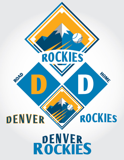
Rockies - I hate it when teams go by their state name so I renamed the team Denver, which of course makes much more sense. Also, purple isn't good for sports. It just isn't. Some teams do it well, but I think in order for purple to work you have to have history. The Rockies have no history. Drop the purple, add the Colorado colors. I drew inspiration from a lot of things for this one. It's a combination of several elements, but in my mind an improvement on their current look.


No comments:
Post a Comment