Monday, January 30, 2012
Sunday, January 29, 2012
SPORTS LOGO REDESIGN
Bulls - You could call their current logo "classic" but I don't think it's timeless. I like sports logo's that focus more on the city than on the mascot. So I dropped the Bull and put Seers in there.
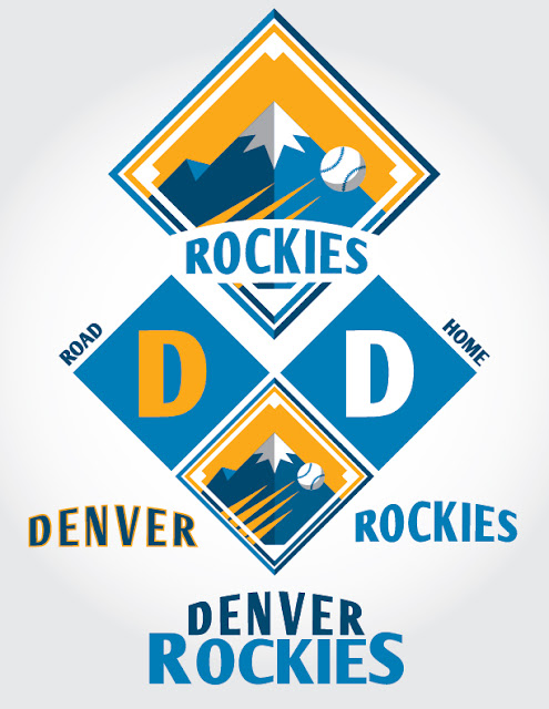
Rockies - I hate it when teams go by their state name so I renamed the team Denver, which of course makes much more sense. Also, purple isn't good for sports. It just isn't. Some teams do it well, but I think in order for purple to work you have to have history. The Rockies have no history. Drop the purple, add the Colorado colors. I drew inspiration from a lot of things for this one. It's a combination of several elements, but in my mind an improvement on their current look.
Monday, January 23, 2012
Thursday, January 12, 2012
GANCREDEVIL
There's this artist that I found on DeviantArt whose stuff really inspires me. What he does is draw cartoon/comic characters but with his only little changes to them. He mixes characters together who, in their own individually created worlds, would never meet each other (Ex. Inspector Gadget and Iron Man). From what I can gather, I assume that he pencils the drawings and then colors them using photoshop. I have never carried an illustration that far so I was inspired to give it a try. So I followed suit with my own imaginative character mashing that looks nowhere near as good as this guys. But its a start. So basically Daredevil and Mr. Incredible are fighting Ganon. Enjoy, more to come.
LOGOS
Here are various identities I've created either for a client or designs I've submitted in contests and am happy with.
Subscribe to:
Posts (Atom)


